
Why does CVS’s website suck
Insights into internal silos

A friend said he was confused why CVS’s website sucks, which is a good question. From things I’ve seen, the answer it more complex than not hiring engineers and designers. The CVS website sucks because different teams have different goals for and own different aspects of the experience.
When I worked at a mental health company, there were engineers, designers, a coaching team run by an operations team, a VP of Sales, and a client management team. The teams were all solving different problems in different ways.
Coaches were great at empathy, which our users appreciated. But the coaching team was spending half of the time they spent talking with our users on the phone explaining to them how to use the product. That should be the digital product’s job. And big inefficiencies like this piss me off. Huge waste of money and huge waste of everyone’s time.
So we collaborated on a set of user experience principles that we shared between the design team and the coaching team, even though we were in different departments. Which let the coaches focus on what they needed to do, and improved the digital product.
Another time the VP of sales asked for the design and engineering team to create a new product for a therapy service for companies. He was selling this to the people that manage health benefits at a company.
The bad version of what could have happened: the sales person asks his clients what features they most want, and then he gives a list to the designer, and then we’re stuck with that solution. Then the design probably sucks.
So instead, I talked to the sales person to get to know the deepest pain points of his clients. And turns out they had executives call them in tears because they couldn’t manage to find a therapist. Or spent an entire day trying to find a therapist for someone at their company. I also interviewed the other people in our company who had a stake in this project. And learned about their biggest pain points. And crafted a unified strategy statement about how the new tool would solve these different parts of our organizations’ problems. So they knew that the tide would rise together. And what we ended with was a beautiful tool that integrated different teams’ needs into one smooth and unified experience. It made the product a lot better.
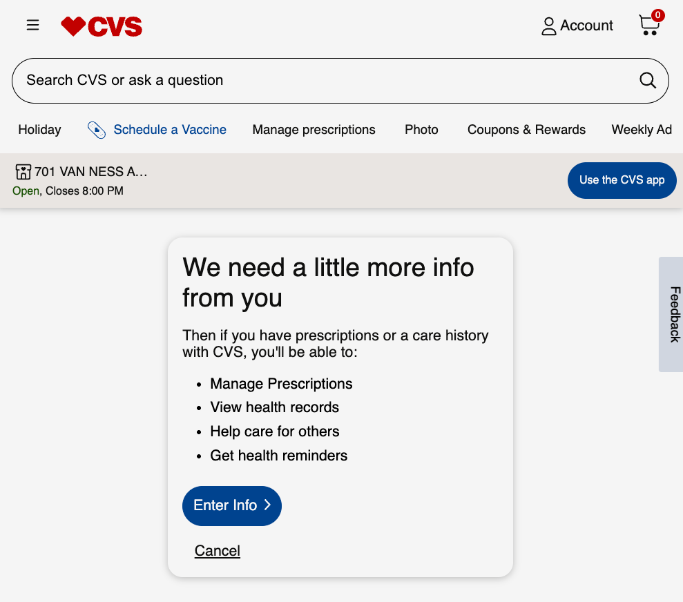
At CVS, if you want a smooth user experience, by default it doesn’t happen. I looked into it more and I thought CVS was a store, but actually it’s a health ecosystem. With an insurance company, pharmacists, people who manage drug negotiations, nurses who work with clients, health clinics, all with different divisions. Maybe working in different states. They make billions by managing more and more aspects of someone’s interactions with healthcare.
Let’s say one team at CVS does the digital patient records, which is how you log in to your CVS account. A completely different team coordinates with nurses to do appointments, which is how you schedule your vaccine. The user doesn’t care that signing in and making a vaccine appointment crosses over different teams, they just want a smooth experience.
My friend told me that the interface design patterns changed six times when he was trying to do one thing on the CVS website. We’re not seeing mismatched designs cobbled together because they don’t have good engineers and designers. We’re seeing a window into an org that doesn’t know how to articulate for each team how a better UX would help their bottom line, and create a unified design strategy that supports each team’s goals.
It’s a fun and complex problem to try to unify departments, but it’s not as simple as these people sucking at design.
Sloppy UX can also be truly dangerous., nit just infuriating. My current target of ire is the clowns who approve the interface and usability of my Hyundai's "infotainment" system. Every time I start the thing, I am supposed to read some lawyer bullshit and hit the Confirm key. Like I might not "drive carefully." And the thing can remember MOST of my settings and prefs except for a major one that I have to et EVERY time I drive the thing. (It's actually a real safety-related setting). My previous car - a different model made by the same company - did not have this issue. The manufacturer's response to my complaint was "it really doesn't take much time to push a couple of buttons. Of course, it wouldn't take much time to actually coordinate the UI across the model lines, but apparently they have "rules" against that. In most cases, this is aggravated by the simple fact that the designers rarely are actual end users. Samsung is even worse. They all seem to feel that we should adapt to their "vision" of the universe. In stead tis just pisses off the mort important people in the life of their organization - their users. But now I am simply rambling and it is your fault that I am not doing something productive.